Since the first consumer camera was introduced more than 130 years ago, photography folders have provided a solid means for organizing and protecting developed and printed images. Somewhere down the line, ambitious photographers began to use them to market their services and separate themselves from the pack by branding their work.
Presentation folders for photographers should be taken seriously because they represent your brand and can be the first impression clients get.
They are used for presentation purposes and often house a portfolio or contain other marketing collateral such as business cards, brochures, flash drives, and media discs.
To give you something to aspire to, we’ve created the first-ever roundup of presentation folders created specifically for photographers. We’ve also listed what we like about them, which can act as customization tips and ideas for your own branded folders to elevate your marketing arsenal.
1. Cut it out
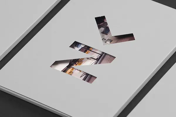
Source: Luka Žanić Photography
A custom die-cut not only adds another unique element to your design, but it also can give people a peek to the folder’s contents as is the case with this design from Luka Žanić Photography. The large monogrammed logo die-cut on the cover reinforces the brand and serves as a window to the images inside. A cool gray background adds a modern element to the design but doesn’t take away from what’s peeking through the die-cut. Also, consider using die-cuts to customize frames for your images in photo folders.
2. Don’t overdo it
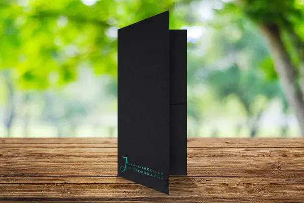
Source: Company Folders, Inc.
Sometimes, a simple design can say more than a busy one. That’s the case with this folder for Jennifer Keller Photography, printed by Company Folders Inc. The sleek, black background makes the blue-green foil stamp pop. A funky capital “J” doesn’t take away from the elegance and sophistication of the design but instead adds a light-hearted, playful tone to it. Having such a simple design shows that you won’t overdo it with edits and embellishments on the photos, which is something clients will appreciate. There’s nothing worse than not being able to recognize what’s in the images because they have been over-edited.
3. Be consistent
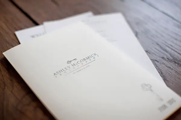
Source: Ashley McCormick Photographer
It’s important for design elements such as font, colors, and logo to be consistent throughout not just the folder, but other marketing collateral, too. In the case of Ashley McCormick Photographer, it’s key, as illustrated by her logo. The vintage key is displayed twice on the cover of her sales folder. This type of design lets potential clients know the photographer values paying close attention to the details and will do the same for them. In addition, the use of a serif font illustrates the photographer is reliable and adds another traditional element to the design.
4. Add another panel
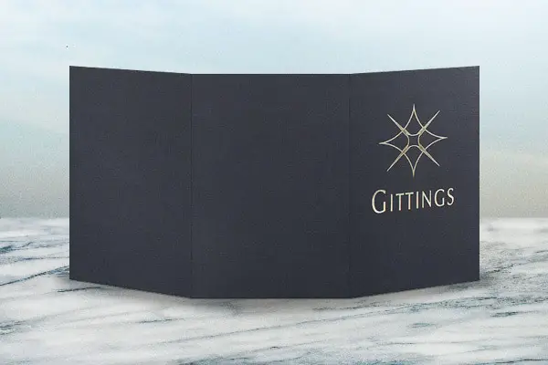
Source: Company Folders, Inc.
It’s easier to separate your material when you have an extra panel. You can include information about your business and price list in one panel and still have two other pockets to store samples of your work. You can put portraits on one side and candid images on the other side. Gittings tri-panel presentation folder has plenty of room. The shiny gold foil stamp combined with the black linen stock oozes luxury. Its large logo lights up the cover similar to a camera flash lights up a room. The use of all capital letters in the business name alludes to its dominance in its field.
5. Create the total package
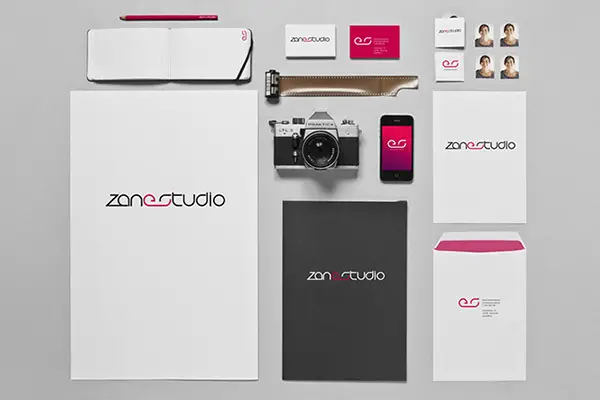
Source: Zane Studio
It’s important people know an item is from you whether it’s a business card, folder, or envelope. That’s the case here as Zane Studio uses a black, white and fuchsia pink color scheme on every piece of marketing material for the business. This color scheme illustrates the business is formal and playful, which shows it will do a good job and have fun doing it. The E and S combine to create a logo that looks like a roll of film, which tells customers this is a photography business in a unique way. Clients will be able to distinguish the business just by the bold logo.
6. Use symbolism
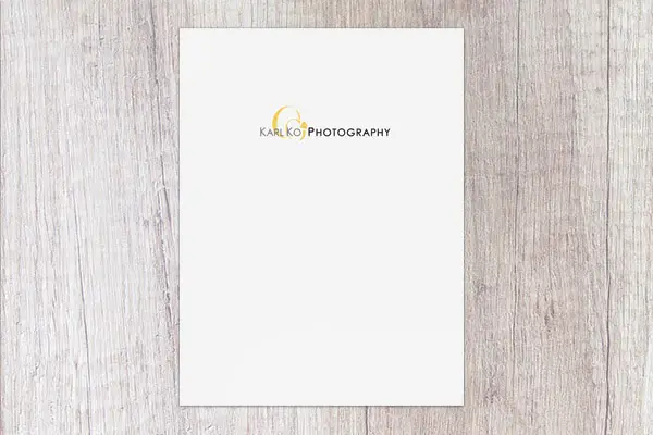
Source: Company Folders, Inc.
You don’t always need words to describe your business. An image of a pair of wedding rings illustrates the type of events shot by Karl Ko Photography. Making the rings bright yellow helps them stand out and evokes feelings of optimism and happiness. They also put clients’ focus on the name of the photography studio, which is featured front and center. The sans serif font adds a modern element to the clean, simple design. Using all capital letters demonstrates the professionalism and knowledge the studio will bring to the job.
7. Appeal to emotions
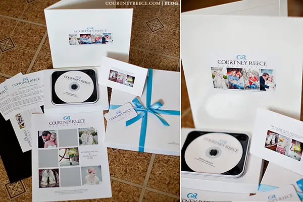
Source: Courtney Jones Photography
As a photographer, you have the best asset to appeal to clients’ emotions — images. Courtney Reece Photography uses heartfelt images on her folder. Photos of happy people embracing are highlighted on the cover, illustrating this photographer knows how to capture those special moments without imposing or compromising the photo’s composition. Her logo is a cleverly designed monogram but looks like a delicate graphic that could be featured on a wedding invitation or other type of formal stationery. The serif font adds a traditional element to the design.
8. Use a unique logo
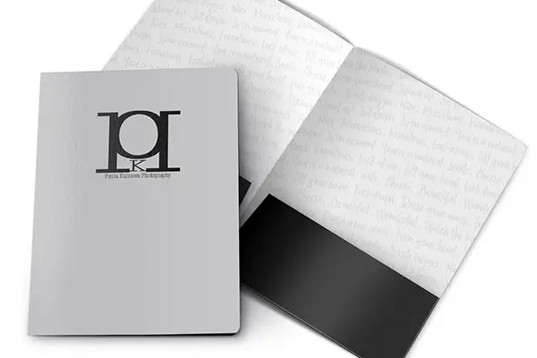
Source: Paula Kurzawa Photography
A creative logo will help clients identify your business and remember it when they are in need of your services. This folder’s logo looks like the lens of a camera. It is made of a regular and backward capital P with a K in the middle, the monogram for Paula Kurzawa Photography. Words clients would hear during a photo shoot span the inside panels in a subtle gray that matches the cover, which evokes happy feelings from the client. There are a variety of free tools available to create a logo or you can consult an expert.
9. Play with textures
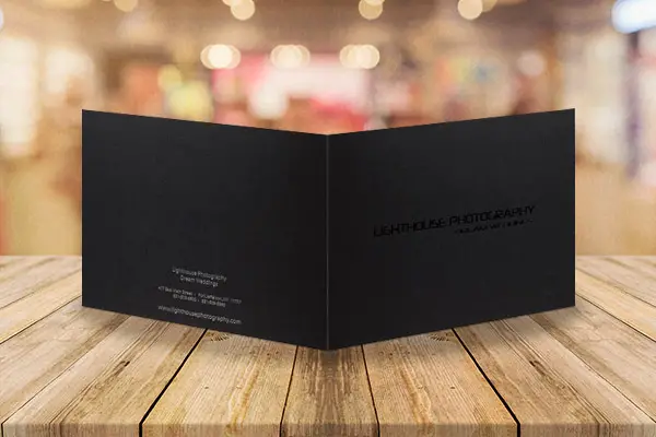
Source: Company Folders, Inc.
Using different imprint methods and unique stocks can add to clients’ experience because they’ll remember the different textures of the folder and how it felt in their hands. The black foil stamp on the cover of this presentation folder for Lighthouse Photography adds a smooth texture to the rough black linen stock. It also adds a subtle shine and hint of luxury. In addition, clients can run their fingers over the indent left on the inside from the covers’ foil stamps. While the platinum foil stamp on the back is a little more noticeable, it sticks with the formal tone set by the cover. as per the where to buy stamps, its good opportunity for every photographers who are looking to get stamps online.
10. Add a special touch
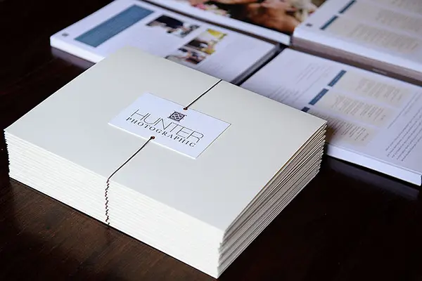
Source: Hunter Photographic
Adding an extra tangible element to the folder can also improve your design. For Hunter Photographic the design isn’t on the actual folder, it’s attached. A small card with the business name and logo is affixed to the neutral beige folder with a brown string. The string serves multiple purposes in that it secures the folder, so the contents don’t come out, attaches the name card and ties the design together because it matches the card. It also adds a special touch as clients’ anticipation grows as they turn the folder over and untie the string to reveal what’s inside, almost making it feel like a present.
11. Start from a template
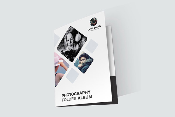
Source: Devit Smith
If you aren’t sure where to start, there are plenty of places to find a template, some of which are free. This will allow you to customize as much or as little as you want. Devit Smith really made this photography presentation folder template his own with an array of images. Though the design isn’t unique because it’s a template, Smith’s images are, which is the most important part. Each image provides a great example of the types of images in which he specializes from portraits to candids and everything in between. The neutral color scheme doesn’t clash with the images and gives off an organized, professional vibe.
12. Use various slits
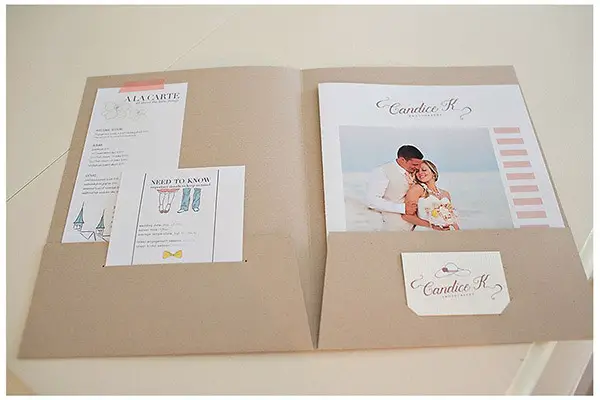
Source: Candice K Photography
Having a place for your business card in the folder is expected but consider using different slits on the other pocket for extra storage. Candice K Photography prominently displays its business card on the right pocket, but then adds a long, horizontal slit on the left pocket to hold a smaller information card that might otherwise get lost in the shuffle. Using a similar color scheme and font on each element ties everything together. The pink and brown color scheme evokes calming, romantic feelings, fitting for wedding and engagement photo shoots, and the script font adds another feminine touch to the design.
13. Keep it clean
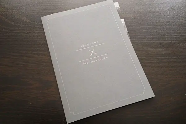
Source: John Kemp Photographer
Don’t forget, your folder design is a representation of you as a photographer. A clean, sleek design gives the impression that you are professional and organized. That’s the case with this design from John Kemp Photographer. This cool, timeless design features a crisp, white frame outlining the cover and putting the focus on the business name and logo in the center. More lines add to the exclusive vibe and separate the name from the logo, which is a simple, contemporary monogram. The modern font also keeps with the stylish, sharp theme of the design.
14. Get rustic
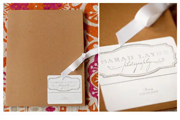
Source: Sarah Layne Photography
People like to select service providers who have similar beliefs. Sarah Layne Photography shows it is environmentally conscious by using stock made from recycled materials. Instead of using an imprint method directly on the folder, she places a sticker on the corner of the cover. This saves money because if any of her studio details change, she can make new stickers to place over the existing stickers instead of tossing the folders, which also is better for the environment. The serif font, gray color and frame in the logo on the sticker add the vintage vibe of the design. A soft, satin ribbon used to keep the folder closed provides a contrast to the stock and also adds a feminine, elegant touch.
15. Be bright
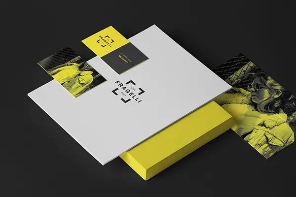
Source: Fragelli Photography
Surprise customers with a pop of color on your marketing materials. Fragelli Photography uses a cool gray for its presentation folder, but the elements inside are bright, cheerful yellow to put clients in a good mood. The logo, which is featured on the cover and other inside materials, puts the focus on the photography studio’s name. Its square shape represents professionalism and security. The folder itself is everlasting and will match most colors should the photographer change the contents.
Bonus Tip: Emboss to add style
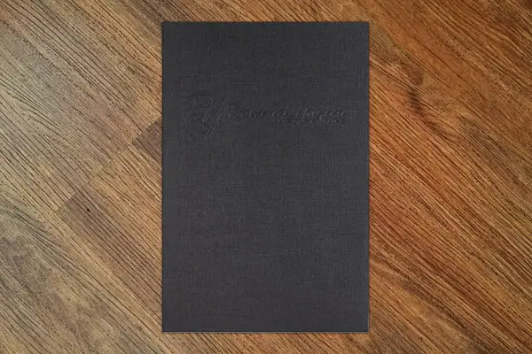
Source: Company Folders, Inc.
Using an emboss imprint method can add a formal element to your design. Combined with a black linen stock, Roland Gozun Photography uses an embossed logo and company name to add a level of exclusivity to its design. Clients will expect to see this photographer at all of their black tie affairs after receiving this folder. In addition to the fancy look, the design also features a unique touch for clients as they trace the logo and business name with their fingers. First on the logo, a circle around a monogram, which represents the photographer’s sense of community and connection that he forms with clients. Then, along the business name, which is in a script font to increase the elegance and sophistication of the design.
Today, the tools of professional photographers are more accessible than ever. Amateurs and prosumers alike encroach upon what was formerly the domain of educated professionals in a highly technical field. Marketing is now more important than ever.
The photography presentation folder is a popular tool for photographers that want to look their best when presenting their product to clients and distributing their portfolio or sales materials to prospective customers. Essentially, it projects a polished image of the photographer or company it promotes.
We hope this collection of custom printed folders gives you a good idea of how modern photographers are presenting their work. Do you have other design tips? Leave them in the comments below.