Setting the tone of an image is arguably, the most important part of any photograph.
As the photographer, this choice can help to define your overall style; making your work instantly recognisable purely by the tone of your chosen medium.
You have to consider the composition, exposure and all those other technicalities. But it is how the subject is portrayed that gives an image its final lasting impression.
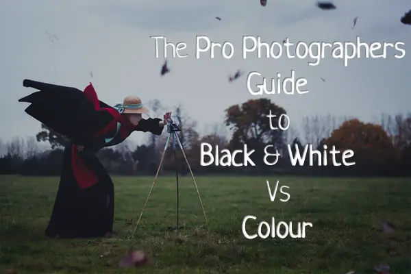
Make Or Break Time!
When deciding to take a photograph, here in this digital age that we all find ourselves in, you have the choice of two “make or break” options available at the moment of pressing the trigger; black & white or colour.
One of the many joys of photography is pondering this very notion in pre and post processing. This never used to be the case around fifteen years ago when it all came down to the film you happened to have loaded in your camera at that particular moment in time. Photographers had to consider the various contrasting colours of the image and if it balanced out correctly in the processing lab.
Assuming that you brought your camera in the last ten years, you have the option for shooting in both mediums. Let’s look at the differences between the two below.
Contrast 101
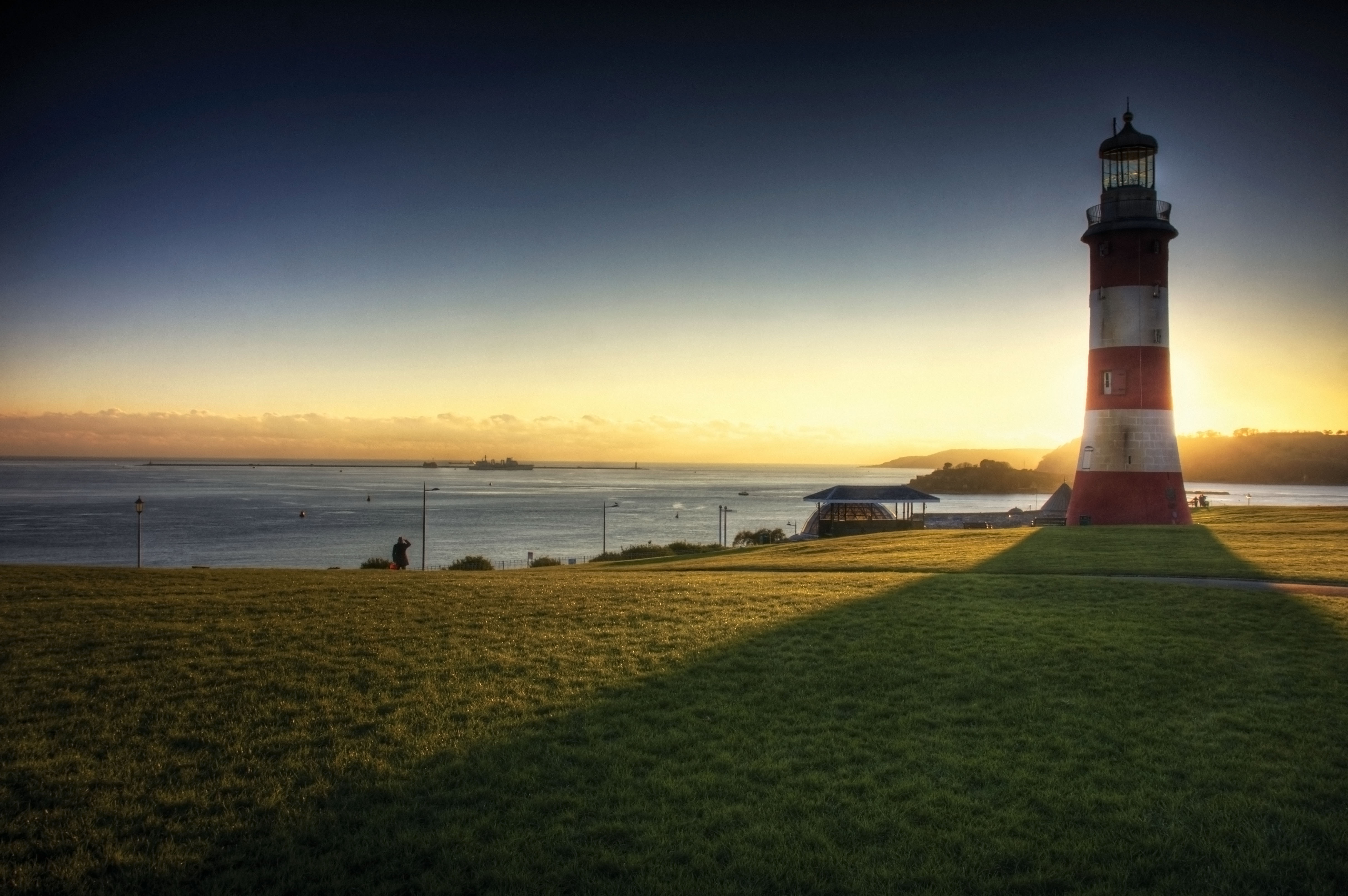
In this first image, the photograph was taken from a coloured RAW image and has been post processed in Photoshop to B&W. No further alterations have been made.
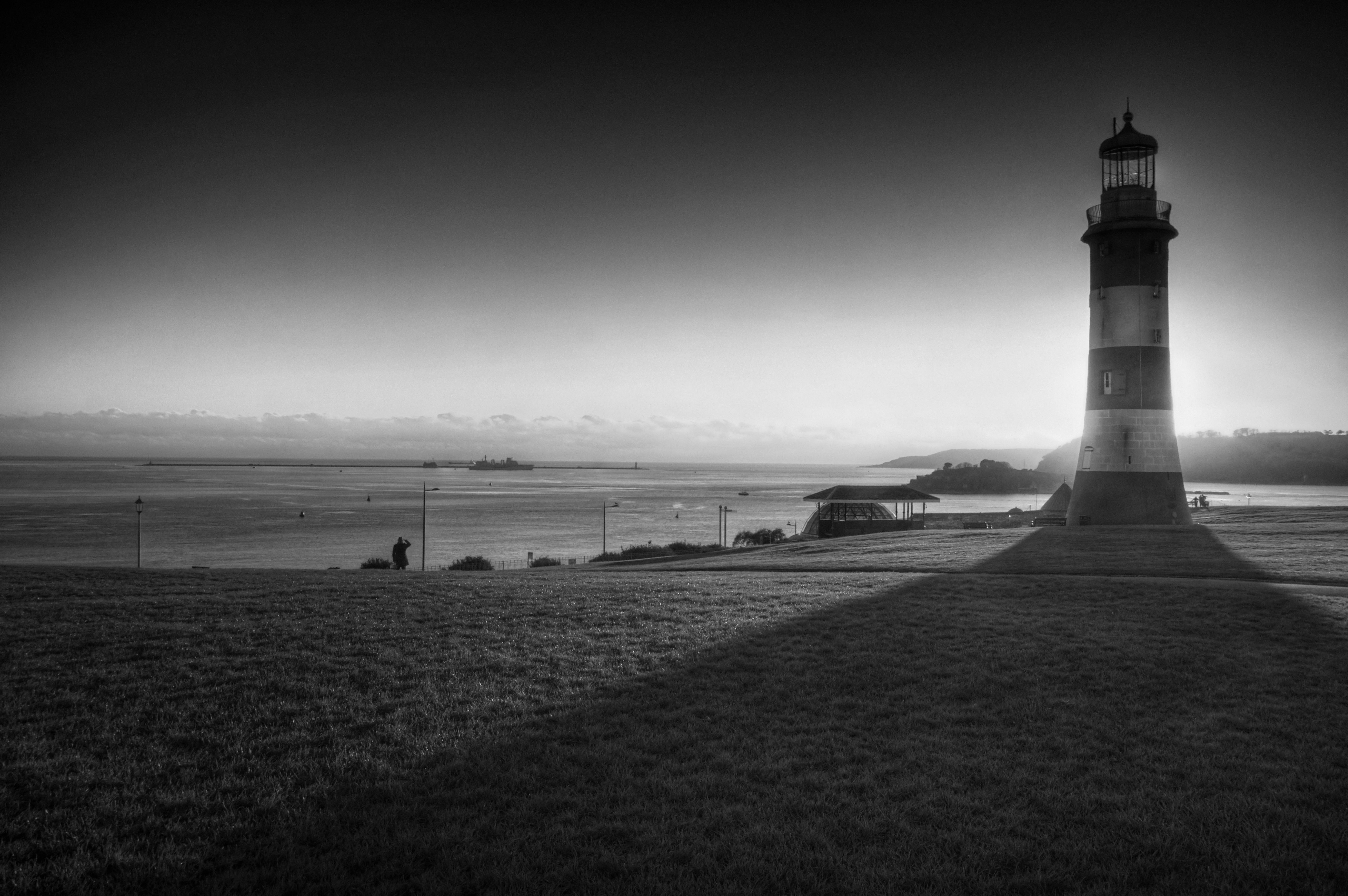
For a black & white photograph, this image contains far too many levels of varying greys, which can make the image quite flat and soulless.
It is important to note, that when shooting purely in B&W it is always best to work with several contrasting colours in the field of view, otherwise you’ll end up with too many greys, which can only make for a rather boring photograph that only your dear old Nan will enjoy!
You can of course alter the contrast within Photoshop and other image editing software tools, which can make up for this. However, you run the risk of sacrificing the finer details of the image.
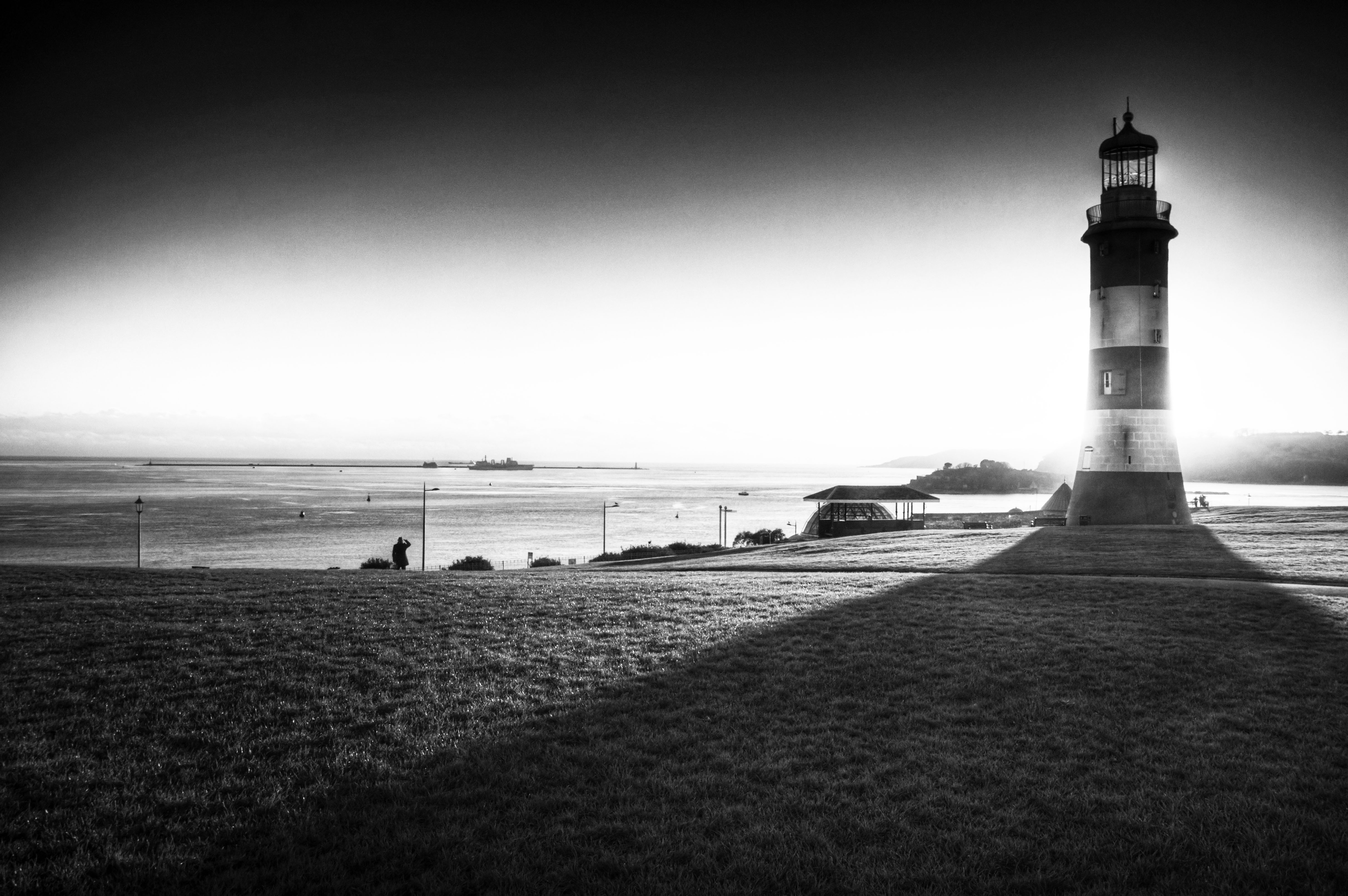
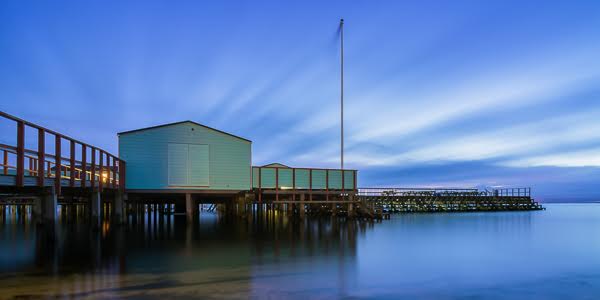
As you can now see from this second photograph, there is considerably less detail in the highlights. Yet, far more impact overall. There is a much better defining balance between the blacks and the whites creating an altogether sharper and moodier photograph.
This increase in contrast regrettably, has blown out the white to rather ridiculous extremes; drawing the focus away from the lighthouse and into this central channel of bright white, that covers the entire photograph.
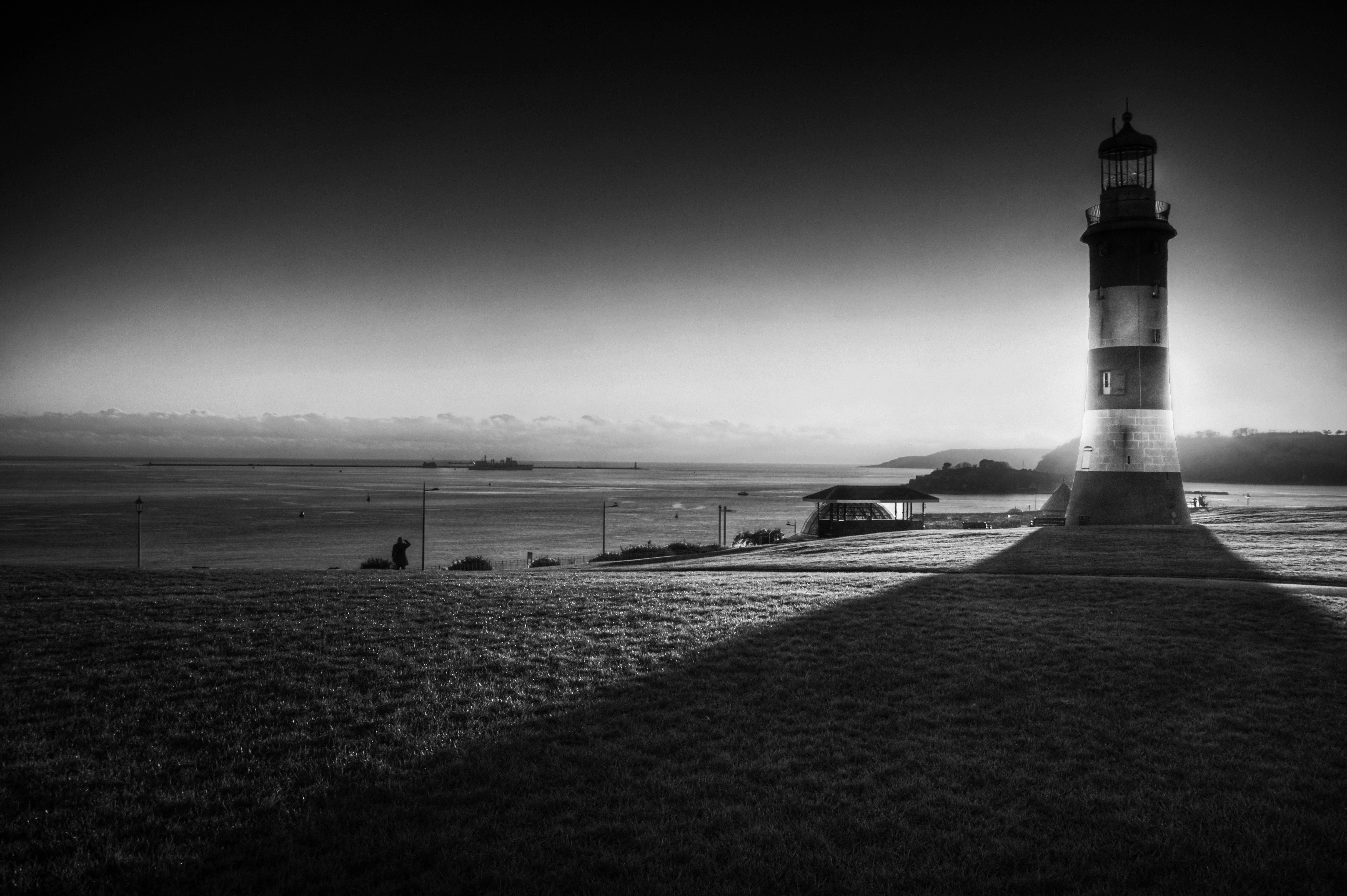
The key is finding the right balance. With this final image, you can see that the attention is on the Lighthouse, the man and the ship in the distance.
Looks Awesome Let’s Print it!
Rather annoyingly; unless you have an expensive printer, this can also be a somewhat frustrating task; certainly if you intend to hang the final image.
As much as LCD screens have helped massively with photographic editing, when it comes to printing, the screen’s backlight can quickly become your worst enemy, so it is advised that you purchase some cheap photographic paper to experiment with first, until you are happy with the results to move on to the more expensive paper.
Or, if you have the dollar, and want to save yourself the time (and be Eco friendly in the process) you can get yourself a monitor calibrator. The i1 Display 2 is by far the best on the market.
Now when it comes to colour, it really is down to personal preference and ultimately what it is that you want your image to say.
Every Photograph Tells a Story
The best way to approach your decision, is to ask yourself the question “what am I trying to say with this photograph?”
If you’re gunning for mood and grit, then I would say that you couldn’t go far wrong with B&W. Yet, both can help to portray the narrative of a photograph.
With a B&W image, the feelings are almost always the absolutes that work best. One of my favourite B&W photographers is Bill Brandt.
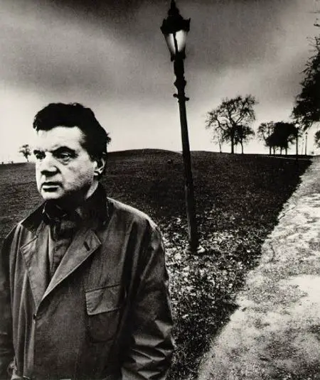
His work is bleak and upsetting, but at the same time defines why the medium is so good at capturing emotion. Some of the best portraits ever shot are B&W, as the medium helps to deliver an extreme connection with its audience.
This photograph for example, would only work in B&W as its message is clearly very violent.
One of the masters of colour photography is Peter Lik. Peter’s landscapes without colour would be soulless and have zero impact. But with colour, the impact is pure beauty. This is due to the multitude of similar colours which create a harmony within the image.
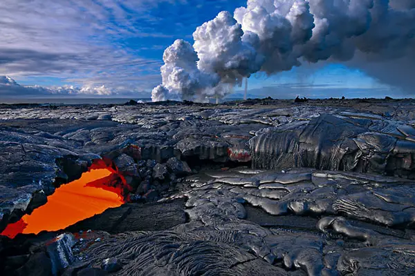
These varying degrees of the palate, can lead the viewer through an in-depth visual feast for the retinas.
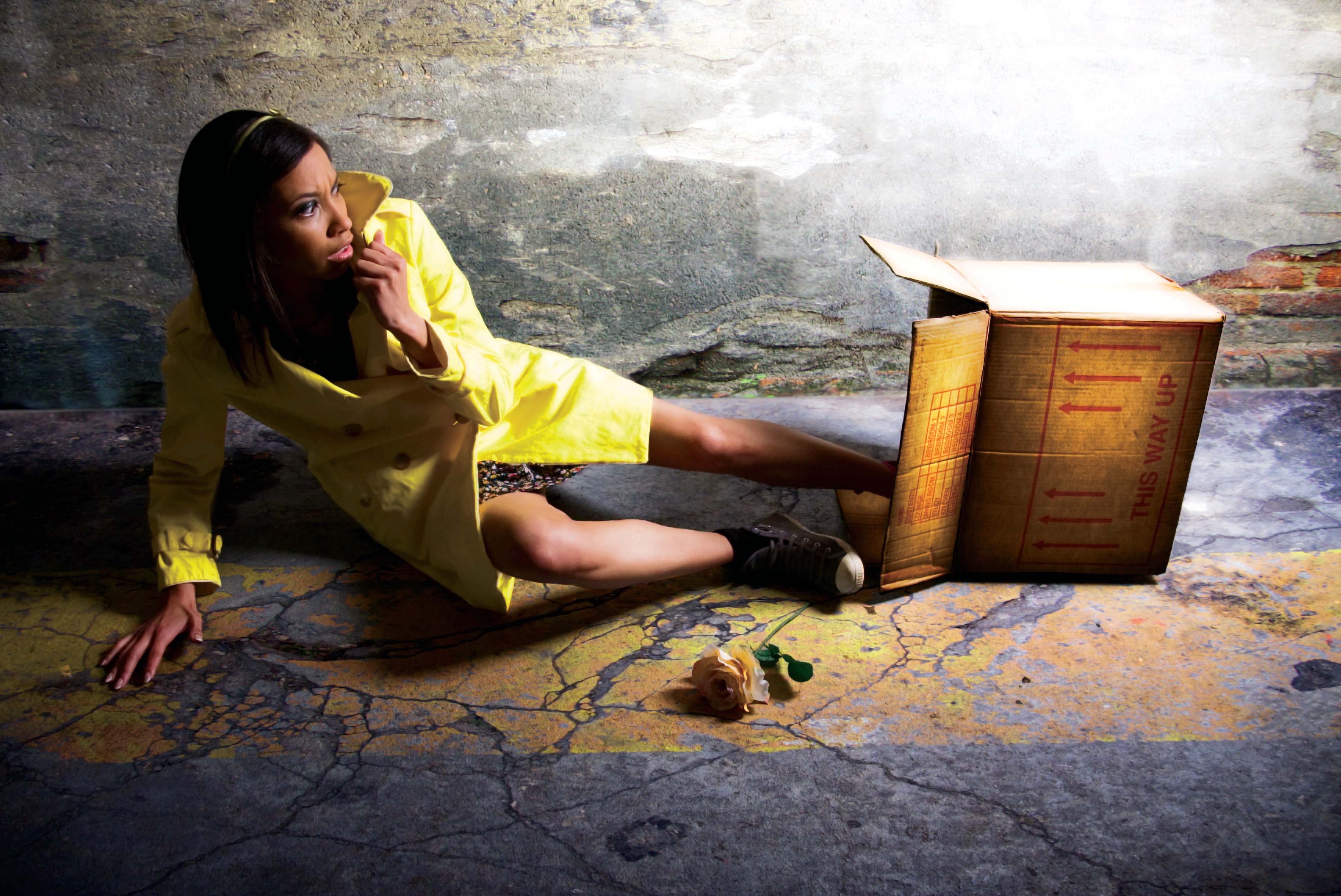
Without the colour, the above image would completely lose its narrative and visual impact, as the colour yellow helps to drive the story of the image.
Just experiment and Have Fun!
One of the many joys that we have in this golden age of photography is that as photographers, we are completely open to experimentation. Long gone are the days of processing labs, the lingering smell of developer chemicals and empty wallets, leaving photographers unable to experiment with such strict budgets.
The next time you’re out on a shoot, if shooting in B&W always consider working in colour if:
- There are too many colours that blend together
- The colour is what defines the subject matter (ie flowers, bright clothing etc)
- There are at least three subjects of the same colour at varying levels
If shooting in colour, always consider shooting in B&W if:
- There is an interesting mix of white and black colours
- The subject matter is extreme in emotion
- It’s bleak, or in some way has a nostalgic narrative
Still can’t decide between the two mediums? The best way to approach any subject if you’re unsure is to shoot them in colour; that way in post you can turn them to B&W and not lose any image quality in the process.
However, the same cannot be said the other way around, but in all honesty, it’s entirely up to you. Which leads onto my questions to all of you, what do you think, Is colour better? Does B&W produce overall, better images? Perhaps you think there isn’t any difference? Please leave your comments below, I’d love to hear all of your thoughts.


The Color Monki Pro is a better screen calibrator 🙂
Interesting article and very well written, good work Robert!
I’d say that both the Monki and the i1 display 2 produce the same results.
X-Rite i1Display Pro if you have the money is way better and looks cooler.
I always enjoy reading your articles Robert, and I have always loved your photography. Keep it coming..
I always enjoy reading your articles Robert, and I have always loved your photography. Keep it coming..
Thanks for the comments! You’re right, the pro is good, but a lot more expensive
I have always been an avid “snapper” but I am far from pro. The black & white shots in this article that have been used to describe certain situations, are exactly what I struggle with. For example, whilst my husband and I were “snapping” in New York 2 years ago, I found myself trying to decide whether to capture the skyline in colour so that it outlines the edges of the buildings compared to the background, or keep it classic with B&W. I wish I had stumbled across this article before, I’ll just have to book another trip to N.Y to try out some different methods!
Thank you
Brilliant info.
You’re very welcome Becca 🙂
This is exactly what my students need to read! Having fallen into the mentality that b&w is the only way to make a gritty image they often sacrifice the sharpness and impact of their origional image.
Am pointing this their way, thanks!
Excellent, do your students have blogs? They should get them, its a great way to share their work with an open community. thanks for the comment!
How did you create the contrast in the colour version of the lighthouse image?
Easy, from understanding the colour wheel. You can use it to get all sorts of inspiring ways to balance your images pallet to make it exciting and engaging. In fact, many photographers never even look at it, but it helps many famous
photographers time and time again to create some awesome impact imagery.
I actually like the first version of b&W, the one that you think it is dull. To me it looks very calm and suitable with the environment.
I think the choice that some photographers make with the b&w is also because of the content of the picture. If it is an emotionally charged picture, then the b&w would be more contrasty and more powerful.
And some photographers have a certain style that they apply constantly on all their pictures. I wonder if this makes sense other than each photographer is free to his own perceptions and way of approaching photographic situations.
I like the fact that you also chose examples to illustrate your tutorial from masters of photography. I would be interested in a section on this website where such pictures are commented in more details. That would be very useful.
I agree, i think it does depend on the indivduals. I’ll have to let the powers that be know and pass on your suggestion! Thanks again for the comment! Robert 🙂
I actually like the first version of b&W, the one that you think it is dull. To me it looks very calm and suitable with the environment.
I think the choice that some photographers make with the b&w is also because of the content of the picture. If it is an emotionally charged picture, then the b&w would be more contrasty and more powerful.
And some photographers have a certain style that they apply constantly on all their pictures. I wonder if this makes sense other than each photographer is free to his own perceptions and way of approaching photographic situations.
I like the fact that you also chose examples to illustrate your tutorial from masters of photography. I would be interested in a section on this website where such pictures are commented in more details. That would be very useful.